How to look at a picture

Many times I have commented on my art writings, and I even have it on the side of my blog as a maxim, that to appreciate the painting “… it is not primordial to understand painting; Painting and good art is felt, loved, touched our inner fiber, heard as good music is heard and according to the sensitivity of each person is appreciated and enjoyed differently, but no one should do “literature”, not make by the word what does not reach our heart through sight. It’s not just about looking, but about learning to see, and perhaps a clear example I can suggest is found in one of my works, The Woman in Blue, where balance is built through color and composition.
“However, there are some concepts and rules that can help us know how to look at a picture and understand better, not its beauty that, as I say, we have to contemplate with the heart and subjective emotion of each one, but rather to analyze why and how an artist achieves through a series of elements and techniques (we could say in a more vulgar sense “tricks”) the attention of the viewer and create a harmony on the pictorial surface.

Much has already been written on this subject and many are the books that go into this complex and particular subject of art (perhaps one of the most suggestive is Susan Woodford’s “How to Look at a Picture”). It is not my intention to go deeper into it, but to give you a few clues as to how it can be appreciated with some certainty if a painting is of quality or, on the contrary, its mediocrity becomes evident, keys that I have collected observing over the years the works of the artists I admire, the mistakes made by other artists as well as my own as a painter.
THE SUBJECT OR REASON
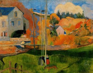
The subject or motive of the work has in my opinion a relative importance. Lo más importante es cómo se pinta y no qué es lo que se pinta. The most important thing is how you paint and not what you paint. On this topic I have already commented my opinion (in Spanish) on “Realism, Expressionism and Abstraction”.. However, although for me the motive has relative importance, it is necessary to avoid some themes that are out of date, absurd, fancy, cheesy and even unpleasant; For example there are some painters who paint scenes of the nineteenth century, floats with horses and people dressed in other times. In my opinion an artist should choose the motives adapted to his time. Others paint scenes and themes plagiarized as for example women dressed in white on the seashore, mediocre imitations of Sorolla of a pathetic flashiness and also out of place.There are those who paint white horses galloping on a lake or bucolic houses nonexistent in landscapes of stories for children of poor quality. In most cases these themes are painted with unreal colors and lack of harmony, with a mannerist brushwork and affected. Do not be impressed by these bucolic prints, “cards” I call them, which lack any interest or artistic value. For obvious reasons I will not set an example, but many of you already know what I mean. I prefer to show you below an example of how a common theme can be elevated to the category of work of art.
 |
|
August Macke (1887- 1914)
“Marienkirche in the snow”, 1911 Oil on cardboard, 105 × 80 cm.
As you can see the subject matters little: a simple urban landscape but realized with an original composition, an excellent simplification of the forms and a rich color well harmonized and in agreement with the stroke. Undoubtedly “how” is realized is the great artistic value of this work.
|
 |
| Cézanne’s signature, sober, elegant and discreet |
THE COMPOSITION
 |
| a b c |
| An example of one of my paintings with three different compositions, the same elements in different sizes and positions. In the first composition (a) the spaces are unbalanced, there is an excessive “weight” in the right part of the painting, the female figure has no space ahead and does not “breathe”. In the second (b) the elements are centered, the arrangement is monotonous, the horizon line is in the middle of the picture, there is therefore excessive symmetry and the woman is situated too far to the right creating imbalance. Option (c) is correct, the black door balances the female figure and the plant and therefore the “weights” are well balanced, the elements are united and at the same time there is a variety making the composition original. |

Diego Velazquéz (1599-1660)

Let us observe this work of the abstract painter José Guerrero. In this work, straddling abstraction and figuration, if we turn the painting 180º we lose the notion of the motif and perceive only colors and forms. We realize in this way that these figures matter little on a plastic level (not at a descriptive level), observing the work in all its compositional dimension, full of beautiful harmonies and well-balanced spaces. Something like a beautiful musical composition.
THE DRAWING
The Drawing (“The importance of drawing” ) (in Spanish) is the first thing that an artist must learn, without a good drawing, which is the basis of any figurative representation, everything falls apart. But this does not mean that the drawing must be “perfect”, the drawing must go according to the color, that is to say, when an artist has already learned the technique of drawing, the proportions and the agile stroke, can be allowed according to his criterion deform and exaggerate the real forms to give more expressiveness to the motive,, but as I say above, depending on the deformation of the drawing must alter the actual color to adapt it to that deformation. A realistic drawing with unreal or too bright colors will be unpleasant or shocking in our mind, if we deliberately alter the drawing we can and must do the same with the colors so that their coherence corresponds, that will not cause rest in our mind.

 |
| Drawings of Jules David and Gustave Doré where the line and the detail line are imposed but full of movement and expressiveness. |
 |
| Works of the greatFrench painter Honoré Daumier that shows us that also with the stain can be drawn. |
 |
|
|

THE COLOR
The color is in my opinion the most important element of the painting since with it we can, in addition, add to the composition of the surface and draw by superimposing the different values and tones, transmit emotions and sensations just as it is done with music. About color there are also numerous treatises and books that can help us understand its complexity (I suggest “Betty Edwards’s color,” author’s book “Drawing with the right side of the brain”, which I also recommend). In this writing I do not pretend nor am I qualified to delve into this complex subject, but briefly expose some rather less technical concepts that can help you to distinguish how to value and see the quality or not of a work of art.
 |
| 1 2 3 Simultaneous colors. The same blue box has noticeable variations of brightness if it is surrounded by different colors. Even the size of the blue square (2) seems larger than the others. |
Although the color is very subjective, there are also rules that explain what are the relationships between colors that are harmonious or not, but since these combinations are infinite it is impossible to summarize them, anyway I have told you that all these theories you can find ind in the extensive literature that has been written about this exciting subject. I think there is no recipe for creating something beautiful and therefore it is very difficult to explain how colors should be arranged on a surface so that they are beautiful. Can anyone explain to us the reason for a good chord between notes of a melody? No, it is something beyond our senses that gives us the wisdom to discern the truly beautiful from the trivial. When one observes a work of art, one must look at it with the eyes of open emotion and, on the other hand, those of half reason closed, observe it without giving too much importance to the elements of the motif that compose it (if any). If we look at a tapestry, a print of a beautiful dress, a late afternoon after the rain or a sunset, we are not carefully observing the elements separately, but we delight in the set of colors and shapes as if it were a whole, And we exclaim: How beautiful! So we must observe a picture, the pretension of wanting to analyze everything, to look for imperfections, leads us to forget the work in a total way, thus losing the absolute perception that is the arrangement of colors and forms, which undoubtedly are the music of the painting . However this does not mean that we should not fix our attention, once we know how to “see” the whole, in the technical realization of the work. Maurice Denis, a young painter and theoretical follower of the group of the Nabis group led by Paul Gauguin tells us: Remember that a picture – before being a workhorse, a naked woman or any other anecdote – is essentially a colored surface and forms placed in a certain order!”.

THE TECHNIQUE
The technique will be the one that each artist chooses as best suits their style and way of working, but should not influence the valuation of the work. Most “experts” consider that oil painting is the queen of pigments, however I believe that each of them (watercolor, gouache, acrylic, pastel, etc.) can be as valuable as any other if uses knowing its characteristics, possibilities, advantages and defects and of course realizing with the used means a work with trade, beautiful and that transmits an emotion to us.
 |
|
Edgar Degas (1834 – 1917)
As you can appreciate in the pastel technique Degas shows us that any means employed is as valuable as the others in the hands of a master.
|
THE STYLE
The style (“The subject of style” ) (in Spanish) is a very important element in order to learn how to see and value a work of art. It must be taken into account that according to one style or another it must be differentiated and observed with different criteria, that is, each style visualize it within its context, but obviously provided that such work is within the canons of aesthetics, good craft and good taste. I will refer to some of the most common styles.

Woman in the waves
Great exponent of realistic painting. His combative naturalism is evident in his feminine nudes, where he avoids the pearly and unreal textures taken from neoclassical sculpture.

The Nap
Belonging to the realism and French naturalism stands out for its rural scenes, where he wants to express the innocence of peasant man in contrast to the degradation that accompanies the citizen immersed in industrial society. He was one of the most admired artists by Van Gogh.
If the artist opts more for an impressionist style, he must remain faithful to the model in terms of proportions and perspective, but he may have certain liberties of execution, such as a simplification of forms, fragmentation of the brushstroke and a more vibrant color and arbitrary, but with the effects of nature. The spectator will have to take into account these freedoms, but must watch with exigency a good execution, security and harmony in the general hue. Very important in this style of painting is the observation of a uniform light, a general tonality that permeates the whole work so that everything is “bathed” by the ambient light as well as that produced by nature itself. For example, a landscape at dusk should be splashed in all its elements by the orange or pinkish colors that the sky has. On many occasions, a mediocre picture painted in this style lacks these shades producing a scene that is luminously unreal as far as nature is concerned since it always “bathes” everything with a light that harmonizes its own creation. Claude Monet expresses this sense of this fugacity of the moment: “My strength is that of knowing how to stop in time. No painter can work more than half an hour outdoors on the same subject if he wants to be faithful to nature. When the subject changes, you have to stop.”

One of the greatest exponents of Impressionist painting, he expressed, “a plein air” the effects and the changes of the light on the objects, obtaining great harmonies and varied light vibrations.

Four clear examples of Impressionism in which the light of the sun permeates the whole work with the tonalities of the fleeting momento.
As for the different styles of the first avant-gardes of the 20th century, especially Fauvism, Expressionism and Cubism (Surrealism and abstract art I will discuss below) are characterized by a distancing of the real color of the model (local color) and a premeditated intention to alter the forms of nature by distorting or deforming them to achieve an expressiveness and a much more energetic synthesis as you can see in works like Red Nude. In short, the artist is free to create, departing many times from reality, according to his own feelings and emotions. Is no longer subject to perspective, to the real forms nor to the colors of nature.
Once this approach is understood, it is evident that the viewer must judge these works with a point of view much more distanced from the academic canons, if he does not do so the work would surely be judged as incorrect. But this does not mean that it is judged lightly and arbitrarily, in this work also come into play the elements of composition, drawing and color as in realistic works, only need to be analyzed in a different context. The composition should also be balanced and its “balance” impecable. The drawing can afford freedoms and not be “correct” academically speaking, but it must have greater strength, rotundity and an extra simplification that completes this “lack” of description of the object granting a greater expressiveness. As for color, these kinds of works must be observed as a mosaic of beautiful colors, luminous and vibrant harmonies that reach us to the soul like beautiful musical notes, and this is not an easy task; On the other hand the observation is simplified in a certain way since there is no “distraction” of the realistic drawing that can make us exclaim: How well done it is, it is the same as reality! How many times have I heard this phrase that seems to be has many followers. No, no, not here, it is not a question of imitating reality, but of transmitting to us with beautiful harmonies and forms the images that the artist has sifted inside to show them in its purest, essential and expressive form. In almost all of these works, expressionist but also figurative, objects and motives are still recognizable, it is that “creating a new element from nature”, but as always in every work that respects should be avoided the errors of bad taste and T the already mentioned “Art faults”.
 |
| Matisse, The Green Stripe (1905) – Derain, The Weistminster Bridge (1906) Two clear examples of Fauvism, the exaltation of color from the inner sensations that provoke nature itself. |
 |
| Jawlensky, Shokko (1910) – Kirchtner, Scene in Berlin (1913) Two representatives of Russian and German expressionism. Like the French fauvists the color and the forceful line are used to transmit an interior vision of the outside in an expressive and deep way. |
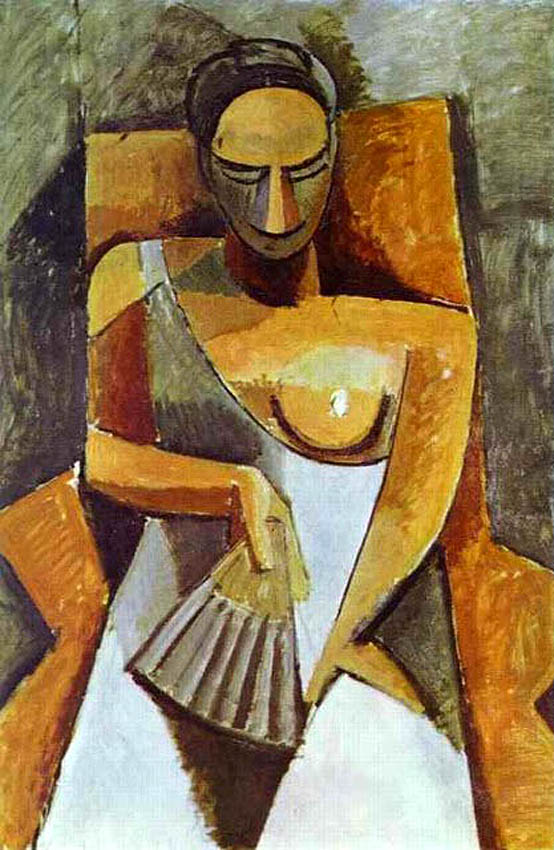 |
| Picasso, Woman with a Fan (1910) A new way of schematizing reality, the simplified and geometric form, the altered perspective with simultaneous points of view, another way to stimulate the imagination of the spectator. |

The Pleasure (1927)
Oil on canvas, 97 × 74 cm

Sodomized Virgin, 1954
A vision of art at the service of the subconscious
Abstract art, which I have already treated in “Abstract art or figuration?” (in Spanish) escapes any recognizable figurative form, so that the “drawing distraction” is out of place. It is necessary to observe the work from a much more intuitive, perhaps more spiritual, perspective, forgetting all acquired learning. Only in the good harmonies and distribution of the forms and lines can we appreciate the work and value it. There is no very differentiated norm with respect to the other styles (fauvism, expressionism, cubism) to know how to appreciate it, we simply like it or not, like music or as if it were a print, but we should not depreciate it and reduce it to the degree of decorative painting. In my opinion in any style you can at the same time make a good work of art and be at the same time a decorative work. I particularly appreciate the abstract works in which it is perceived that in the distribution of forms, colors and lines there is a reasoned order in which a coherence is appreciated, a rhythm that the artist has had to meditate, all in combination with the Intuition and good taste gives us the size of the artista. Simultaneous contrasts generate rhythm, something I explored in this abstraction inspired by Delaunay; I distrust those “gestural” paintings in which everything is chaotic, in which there is no order or coherence and everything seems to be the result of chance. I believe that the problem of abstract art is that in not needing drawing, a craft that must be learned for any other style, there has been an amount of “artists” who have believed to have an innate talent starting in this art without having climbed the previous rungs and necessary to get to the true knowledge of the craft of painting. Nothing is learned without effort and dedication. We should not disregard true abstract artists but differentiate them well from those who take advantage of the confusion that many fans suffer because of all the false “literature” and misleading verbiage in art.
 |
|
Kandinsky ( 1908), Blue Mountain
The motive has almost disappeared in its search for the spiritual through color. As you can appreciate the beauty of the shapes and colors are obvious. Kandinsky is about to achieve after a meditated process the total suppression of every recognizable form.
|
 |
|
Robert Delaunay (1885- 1941)
Electric prism, 1914 The motive has already disappeared completely, however you can clearly see an elaborate organization of forms and colors creating beautiful musical rhythms that show us the talent of the artist. Nothing to do with the vulgar and chaotic abstraction that we can unfortunately see in many abstract works.
|
Obviously there are many other styles and movements that derive from those I have mentione. Art is unlimited, hence lies its surprising attraction. We will never end the new creators who delight us with their own “calligraphy”, since there is one artist of talent equal to the other. Perhaps what escapes me to all artistic reasoning and therefore I do not even mention in this writing as a subject to be valued, is this “art” so in vogue, so protected today and for more than half a century, that I define as “vanguardisticonceptual occurrences”. On this subject, I myself and the friends “Hartistas” (in Spanish) have already wasted a lot of ink. Just one last piece of advice: do not be fooled by the false quackery of those “pseudo-critics” speculators who intend to insult the Art with such deceptions. Simply trust your infallible common sense and you can unmask them in this way.
Translation* in English from Spanish by Silvia Lovosevic, Artist painter of the publication in Spanish “Cómo mirar un cuadro”